
A startup's acquisition funnel can look healthy in a dashboard while feeling broken to the person using it.
The landing page gets traffic. Visitors open a category, pricing page, or product list. Some create accounts. A few convert. Then you try the same journey on a phone.
Navigation that seemed obvious on desktop is hidden behind a vague menu. Comparisons take too much effort. Filters are awkward. Important context sits below the fold. The page takes too long to become usable on a weaker connection.
Mobile exposes these problems because there is less room to hide them:
Can a new visitor understand the offer, evaluate the options, and take the next meaningful step using a small screen and limited attention?
When the answer is no, screen size is rarely the real problem. The discovery experience is.
Product discovery starts before sign-up
Product discovery is the journey from a general need to a relevant product, service, plan, or solution. It includes understanding the offer, comparing options, and seeing enough proof to continue.
Discovery begins when someone first asks whether the company is relevant, not when they reach checkout.
Why mobile keeps the funnel honest
Desktop gives teams space to compensate for weak decisions. A wide screen can hold several calls to action, long explanations, sidebars, comparison tables, and rows of cards at once.
Mobile makes the team choose what belongs first, what can wait, and what should disappear. Visitors may also be browsing with one hand, switching between apps, or using an unstable connection.
The page has to establish relevance without assuming perfect concentration. Each screen needs one clear job in the visitor’s decision.
Support different levels of intent
Discovery rarely follows a neat sequence. Visitors arrive with different levels of knowledge.
Directed visitors know what they want. They need fast search, useful filters, and a direct next step.
Problem-led visitors understand their situation but not the exact solution. They need routes based on outcomes or use cases rather than internal product terminology.
Exploratory visitors are still browsing. Forcing a demo request too early may create an analytics event without genuine interest.
A good mobile homepage supports these states without explaining the entire company. It should answer what the business offers, who it is for, and where to go next.
Specific labels help. "Browse integrations" and "Compare plans" reveal what sits behind the tap. "Explore" and "Solutions" often do not.
Navigation, search, and filters are acquisition tools
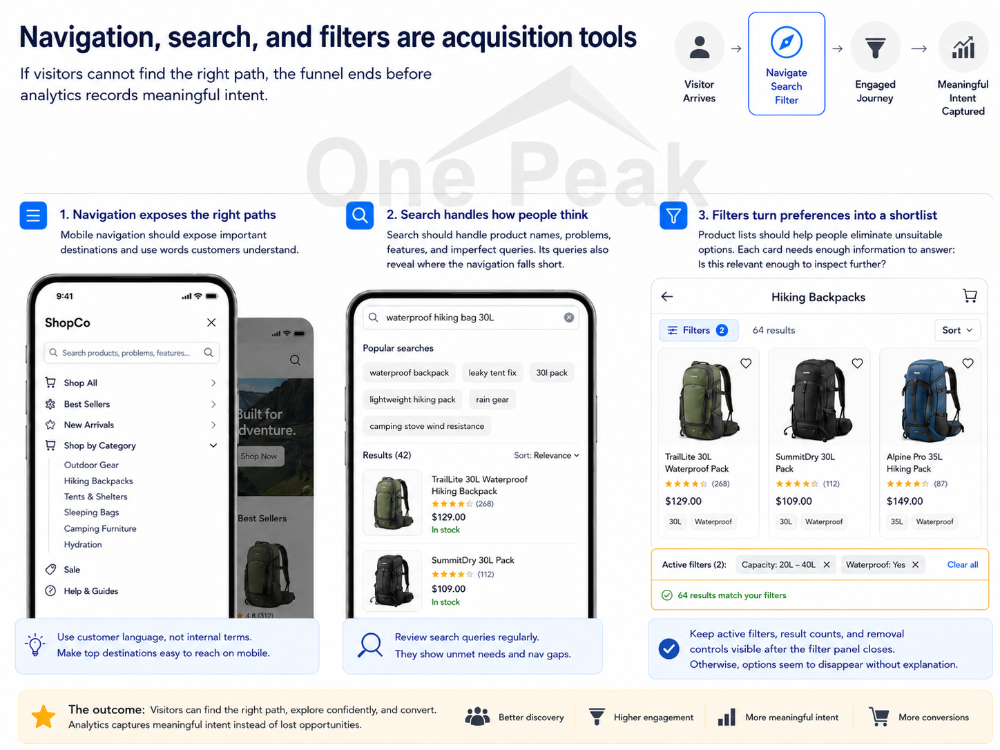
If visitors cannot find the right path, the funnel ends before analytics records meaningful intent.
Mobile navigation should expose important destinations and use words customers understand. Search should handle product names, problems, features, and imperfect queries. Its queries also reveal where the navigation falls short.
Product lists should help people eliminate unsuitable options. Each card needs enough information to answer:
Is this relevant enough to inspect further?
Filters then turn preferences into a shortlist. Active filters, remaining results, and removal controls should stay visible after the filter panel closes. Otherwise, options seem to disappear without explanation.
Measure progress, not activity
Page views, scroll depth, button clicks, and account creation do not prove that someone found the right option. A visitor may scroll because the page is confusing or open several categories because the labels are unclear.
Track actions that show discovery progress:
- search performed and result selected
- zero-result search
- category or filter selected
- relevant product viewed
- comparison or pricing opened
- high-intent action started and completed
Segment these events by device, traffic source, and landing page. A blended funnel can hide low-intent mobile traffic beside high-intent search visitors.
Low conversion may mean the campaign attracted the wrong audience, visitors could not find a suitable option, or the offer itself failed on price, trust, or functionality.
Analytics shows where people stopped. Interviews, usability tests, and session recordings help explain why.
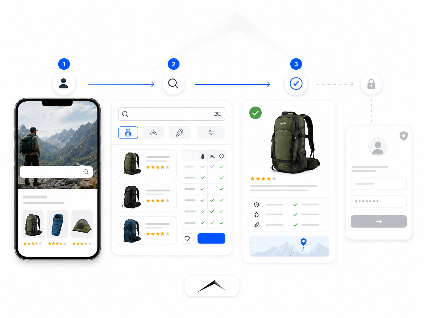
Test the first useful outcome
Account creation is easy to track, but it is not always the first useful outcome.
The useful outcome may be finding a compatible product, viewing the right plan, receiving a recommendation, or requesting a relevant quote.
Make that outcome possible before asking for unnecessary commitment. A visitor may need to understand the workflow and see relevant proof before creating an account or completing a long form.
Run the audit on a real phone
Check whether:
- the first screen matches the message that brought the visitor there
- navigation labels are specific and understandable
- search and filters help people recover from imperfect choices
- product cards show enough information to compare options
- pricing, proof, availability, and next steps are easy to find
- the interface remains responsive on a slower connection
- discovery actions and the first useful outcome are tracked
A resized desktop window cannot reproduce touch, browser controls, interruptions, or one-handed use.
The mobile constraint reveals unclear strategy. A healthy funnel leaves the right visitors more certain that they have found the right solution.