
Most founders treat design like a coat of paint. Something you slap on once the product already works. That assumption is expensive. A visitor decides what they think of your product in the first few seconds, and that first read sets a ceiling on how much trust you can earn afterward, no matter what you do next.
Good UI/UX design isn't decoration. It's the layer that decides whether someone gets your value proposition, finishes signing up, or quietly clicks back and tries a competitor instead. Design touches conversion and retention for an early-stage product, and it even leaks into fundraising, since investors size up a team's execution by clicking around the actual product.
Here's the annoying part. The cost of bad design rarely announces itself. Nobody emails you to explain why they bounced; they just leave. Weeks later a founder is staring at a funnel with 90% drop-off, with no clean way to tell whether the problem is the offer, the copy, or the interface sitting between the two. Get the UI/UX right early, and that whole category of doubt disappears from the autopsy.
Past the conversion number, it gets worse. Confusing onboarding is one of the top reasons early users vanish before they ever touch the thing your product is actually good at. Someone who can't find the button that matters in their first session doesn't dig deeper. They assume the product doesn't do what they came for, even when it does, because the interface never said so plainly. Retention curves at this stage don't forgive that kind of failure, and no clever marketing campaign pulls back a user who already bounced on day one.
Design also colors how outsiders read the team, not just the product. Investors, partners, early hires: they all form an impression from whatever they can click through. A rough prototype tells one story. A coherent, considered product tells a completely different one, that this team executes carefully and actually understands its users. That signal outlasts the first release by a long way.
Picking the right design partner, whether that's a UI/UX design agency for startups, a freelancer, or an in-house hire, belongs on the short list of highest-leverage calls a founder makes before a single line of production code gets written.
What a UI/UX design agency actually does for startups
A capable design agency isn't an art department with better branding. For a startup, the ones worth paying operate across four connected stages.
User research and problem framing comes first. Before anyone draws a screen, a good team figures out who the user is, what job they're hiring your product to do, and what they use instead today. Sometimes that's a handful of structured interviews. Sometimes it's a pile of support tickets from an existing product, or a teardown of three competitors. Either way, the point is framing the real problem clearly enough that every design decision afterward has something to be judged against.
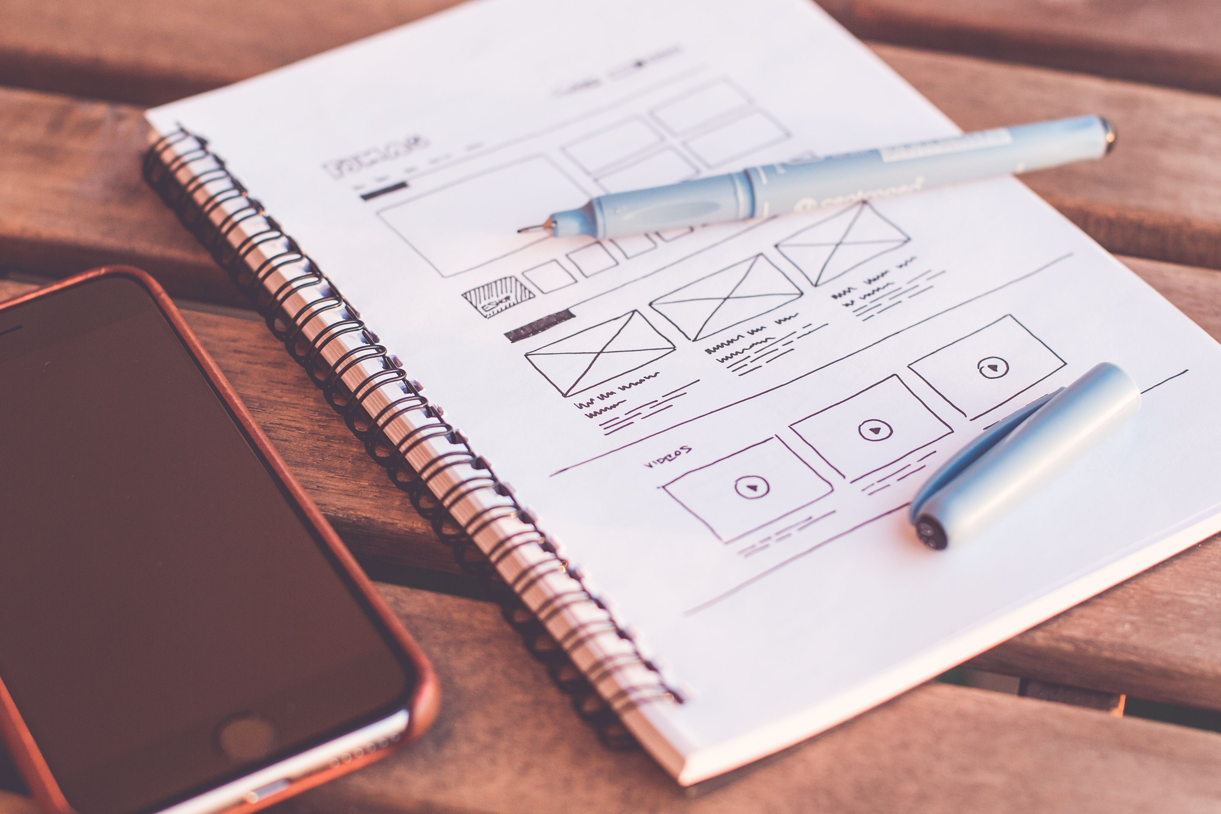
Then wireframes, flows, and rapid prototyping. Structure gets tested cheaply here, before it gets expensive. Low-fidelity wireframes let a team argue about information architecture and flow before anyone's emotionally attached to a color palette, and even a rough clickable prototype exposes flow problems a static mockup hides completely. Startups that skip this step usually find their flow issues after development. That's a much costlier place to discover them.
Once the flow holds up, the visual layer comes in: typography, color, spacing, component states, and the small details separating "considered" from "assembled." A lightweight design system, even a bare-bones one, keeps new screens consistent as the product grows and saves real hours down the line.
Last comes dev handoff and QA with engineering. Design that never touches implementation reality tends to fall apart the moment it hits a sprint board. The better agencies stay involved through handoff, checking that spacing, states, and edge cases (empty, loading, error) survive contact with actual engineering constraints. This is where a UI design agency for startups separates itself from a purely aesthetic studio. It understands what's expensive to build and designs around that instead of ignoring it.
Each stage hands something concrete to the next. Research produces a problem statement, wireframes produce a testable flow, visual design produces dev-ready screens, handoff produces a shipped feature that actually matches the file. Skip a stage and the gap doesn't vanish; it resurfaces later as rework, usually right at the point in the schedule where fixing it costs the most.
In-house designer vs. freelancer vs. agency
Founders default to whatever looks cheapest on paper. Rarely do they line up speed, quality, and ownership side by side and actually compare.
An in-house designer makes sense once you've found product-market fit and have a roadmap stable enough to keep one person busy full-time, usually Series A or later. Before that, a full-time hire either sits underused or gets stretched across research, visual design, and front-end collaboration alone. That's a lot to dump on one person who's also trying to move fast.
A freelancer is great for a narrow job with clean edges: redesign a landing page, skin an already-working flow, produce a defined set of screens. The risk is consistency and availability. Someone juggling four clients isn't always reachable the day you need a same-day call, and there's no second set of eyes to catch what they missed.
A startup design agency is the right call when you're building an MVP from zero and need research, flow design, visual design, and dev-ready handoff moving together as one process instead of three disconnected handoffs. An agency built around startups already gets sprint cadence, thin budgets, and the fact that version one just needs to be good enough to test, not perfect.
Speed, cost, and quality trade off differently every time, but ownership is the variable founders consistently underweight. An agency that treats your product like a shared problem instead of a ticket queue makes sharper calls when requirements shift mid-build. They always do.
How to evaluate a UI/UX design agency as a startup
Plenty of agencies put "startup" in their homepage copy without understanding how a startup actually operates day to day. A few checks separate the ones worth hiring from the ones that'll slow you down.
- Look at portfolio depth, not portfolio size. Have they actually shipped SaaS or mobile products end to end, or is it mostly marketing sites and logo work? A team with real product experience will show you screens with different states, not just hero shots.
- Ask whether they own the full design-to-dev chain. Do they hand off a Figma file and vanish, or stay in the room through development and QA? You want the second answer.
- Check if they can work in your sprint cadence. Startups move in short cycles, and an agency whose process assumes six-week review loops will cost you momentum inside the first month. Guaranteed.
- Watch for red flags: vague talk about "process," zero examples of actual product design beyond landing pages, reluctance to describe a messy real constraint they navigated, or pricing that quietly assumes unlimited revisions with no scope line drawn anywhere.
A ten-minute reference call with a past startup client tells you more than an hour of sales pitch. A logo on a slide tells you nothing. Ask that reference one question: what happened the first time scope or timeline had to change? The answer reveals whether the agency treats change as normal, or as an excuse to bill more and talk less.
It's also worth asking how the agency judges its own decisions after launch. A team that only cares about delivering a Figma file has no skin in whether the design works once real users touch it. One that wants to see analytics, drop-off points, and support tickets afterward is treating design as an ongoing bet rather than a one-time deliverable, and that mindset shows up in the second and third iteration.
How One Peak does UI/UX design for startups
We don't treat design as something that happens before "the real work" starts. It's part of the MVP build itself, running alongside technical scoping so the two tracks actually inform each other from day one instead of colliding in week six.
The process opens with a focused design sprint across weeks one and two: research and problem framing, then wireframes and flow mapping, then a prototype we put in front of real users or stakeholders before a single production screen exists. High-fidelity design and a lightweight design system come only after the flow is validated, never before, so visual polish never sits on top of an unproven structure.
Two of our own case studies show what this looks like in practice. For Eazmenu, a QR-based restaurant ordering platform, we designed a full system spanning the customer-facing menu app, a real-time order dashboard, and a restaurant onboarding and branding flow. The customer side stayed simple; the staff dashboard got dense enough to run real service. For Trainerrr, a fitness app, the onboarding and daily logging flow had to work one-handed, mid-workout, and that single constraint shaped everything: button placement, how much a screen was allowed to ask of the user, all of it.
In both cases, engineering constraints were in view before the design decision got made, not discovered after the fact.
Our take
Most startup design advice treats research, prototyping, and visual design as sequential phases with clean handoffs between each one. We think that model is slower than it needs to be. The teams that move fastest run these threads in parallel, with design and engineering talking daily instead of exchanging a finished file once a sprint.
We also think founders overvalue visual polish relative to flow clarity. A gorgeous screen that leaves the user unsure what to do next will convert worse than a plain one with an obvious next step. If you've only got budget for one of the two early on, put it into flow.
Closing thought
Design isn't the last 10% of building a product. It's the layer users actually experience, and it compounds. Get the flow and interface right early and a startup builds trust faster, iterates on cleaner signal, and spends less time re-explaining a confusing product to people who already gave up on it once. Choosing the right design partner, whether that's an agency, a freelancer, or an eventual in-house hire, deserves the same seriousness as any other founding decision.